Check nearby libraries
Buy this book

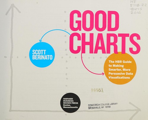
"A good visualization can communicate the nature and potential impact of ideas more powerfully than any other form of communication. For a long time, "dataviz" was left to specialists-data scientists and professional designers. No longer. A new generation of tools and massive amounts of available data make it easy for anyone to create visualizations that communicate ideas far more effectively than generic spreadsheet charts ever could. What's more, building good charts is quickly becoming a need-to-have skill for managers-if you're not doing it, another manager is, and they're getting noticed for it, and getting credit for your company's success. In Good Charts, dataviz maven Scott Berinato provides an essential guide to how visualization works and how to use this new language to impress and persuade. Dataviz is where spreadsheets and word processors were in the early 1980s-on the cusp of changing how we work. Berinato lays out a system for thinking visually and building better charts through a process of talking, sketching, and prototyping. The book goes well beyond proffering a set of static rules for making visualizations and taps into well-established and vanguard research in visual perception and neuroscience, as well as the emerging field of visualization science, to explore why good charts (and bad ones) create "feelings behind our eyes." Along the way, Berinato also includes many engaging vignettes of dataviz pros, illustrating the ideas in practice. Good Charts will help you turn plain, uninspiring charts that merely present information into smart, effective visualizations that powerfully convey ideas. This is your go-to guide for dataviz-the new language of business. "--Provided by publisher.
Check nearby libraries
Buy this book

Previews available in: English
Subjects
Business presentations, Visual communication, Communication in management, Charts, diagrams, Présentations (Affaires), Tableaux, graphiques, Communication visuelle, Communication en gestion, BUSINESS & ECONOMICS, Business Communication, Meetings & Presentations, General, Strategic Planning, BUSINESS & ECONOMICS / Industrial Management, BUSINESS & ECONOMICS / Management, BUSINESS & ECONOMICS / Management Science, BUSINESS & ECONOMICS / Organizational Behavior, Audio-visual aids| Edition | Availability |
|---|---|
|
1
Good charts: the HBR guide to making smarter, more persuasive data visualizations
2016, Harvard Business Review Press
in English
1633690709 9781633690707
|
aaaa
|
Book Details
Table of Contents
Edition Notes
Includes bibliographical references (pages 233-243) and index.
Classifications
The Physical Object
ID Numbers
Community Reviews (0)
| March 7, 2023 | Edited by MARC Bot | import existing book |
| December 10, 2022 | Edited by MARC Bot | import existing book |
| September 19, 2022 | Edited by ImportBot | import existing book |
| July 19, 2019 | Created by MARC Bot | import new book |


